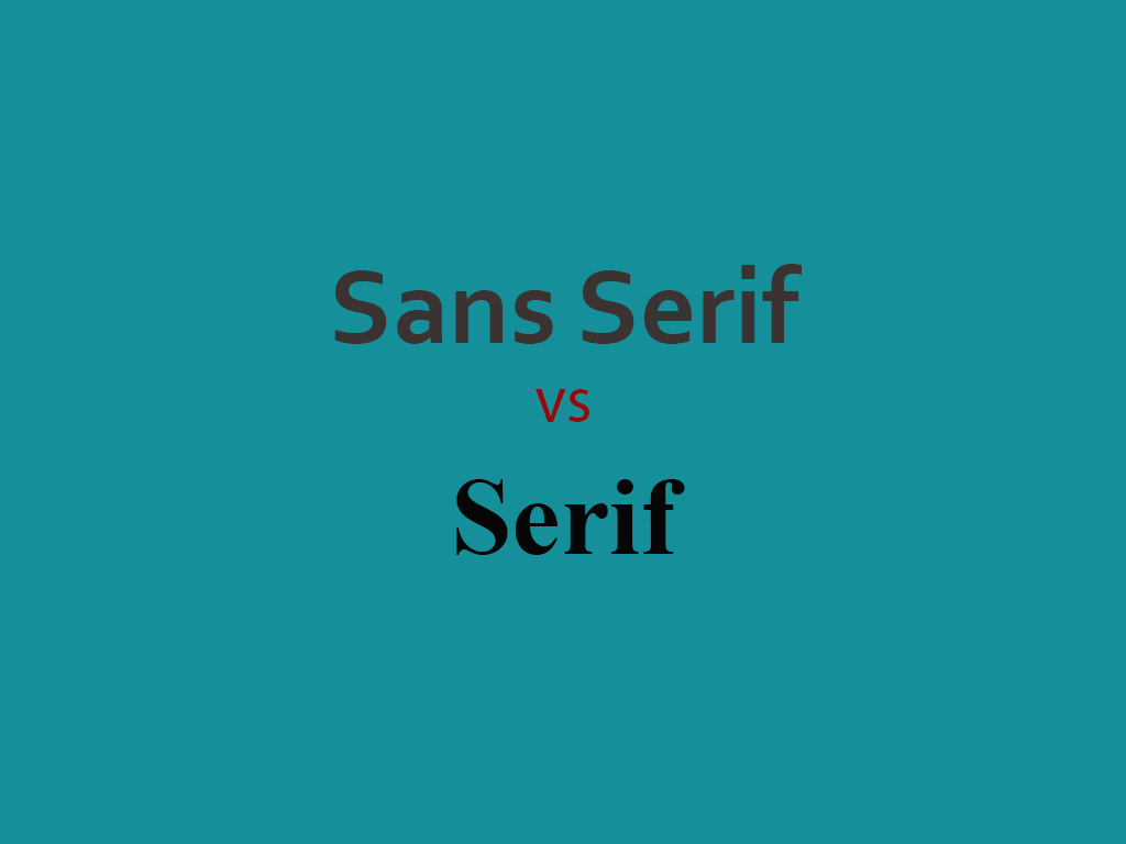
There is an ongoing debate among designers about what makes a font ideal for a project. The debate almost always boils down to one question: serif or sans serif fonts? This applies to both digital design and printing.
Before answering this question, think about everything you know about serif and sans-serif typefaces and all the myths associated with them.
Today we'll take a look at both types of fonts and try to determine if one is actually better than the other, and in what circumstances.
History of serif fonts
Serif fonts are some of the oldest modern fonts. They are used in everything from book publishing to newspapers and magazines, billboards and websites. So what are serifs?
It's a little decorative touch from the letters. It can be tail-shaped, sharp or blunt, ornamental or solid. Each serif font will have its own distinct style for that mark, which makes the family recognizable. Serifs appear on both uppercase and lowercase letters in the font family, as well as glyphs, numbers, and other characters.
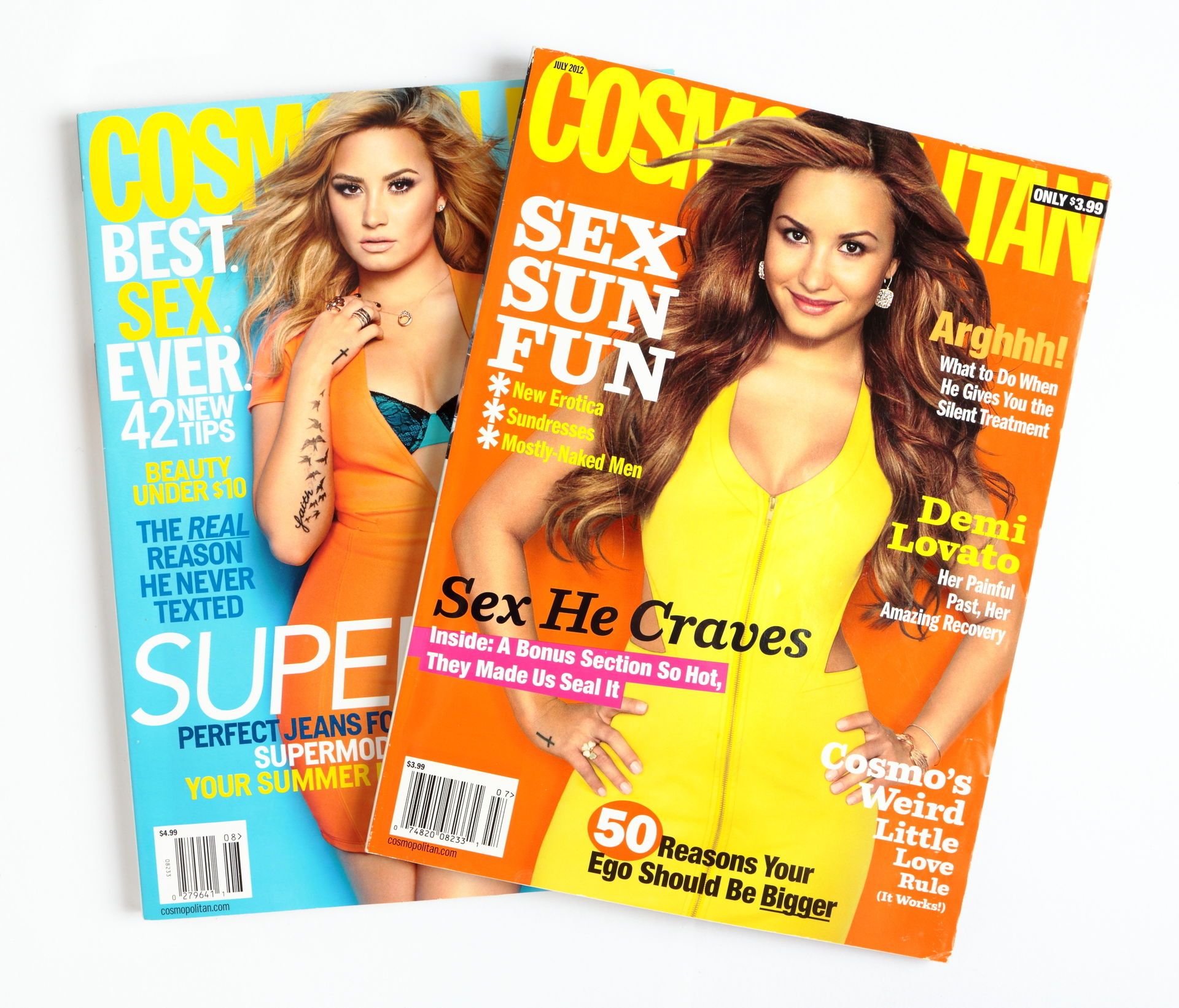
The mood and feelings that are most associated with serif typefaces are classic, elegant, formal, confident, and authoritative. Some of the more famous serif fonts include Times Roman (and Times New Roman), Rockwell, Georgia, and Baskerville.
The new era of sans serif fonts
Sans-serif fonts are considered more modern and come in different widths and shapes. In this type of font, there are no strokes at the ends of letters (hence "sans serif"). It is believed that this category of fonts embodies simplicity due to the lack of additional detail. Sans-serif typefaces appear straight and precise, although the edges of characters can be sharp or rounded.
The mood and feelings most associated with sans serif fonts are modern, friendly, straightforward, clean, and minimal. Some of the most famous sans serif fonts include Helvetica, Arial, Futura, and Franklin Gothic.
Myths and rumors
The problem of choosing a serif or sans serif typeface is compounded by the myths we read every day about the different shapes of letters.
In the past, some of these myths and rumors may have had some meaning, but modern publishing methods (print and online) have narrowed the gap between serif and sans-serif fonts and readability. In many cases, readability issues are not related to the category of the font, but to the actual font and its application.
Use serifs only in print
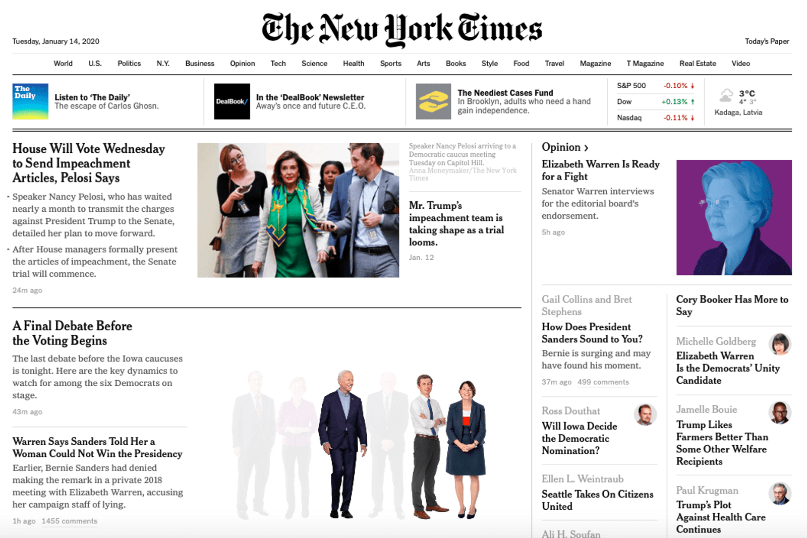
This is one of those myths that is being repeated unnecessarily. Why use only serifs in print? Take a look at sites like The New York Times. It uses serif fonts nicely. It reads well and emphasizes the overall design concept.
So where did this myth come from? The main argument in support of his erroneous theory is that the screen quality is not as good as the quality of printed materials, so serifs are difficult to read on the screen. While some printed material does have a higher publication resolution, this is still a fallacious argument.
Think about how you learned to type. It was probably on screen using Times New Roman (serif). Did this make you uncomfortable?
Think also about the changes in the screens. In the past few years, high definition and Retina displays have become almost the norm. These high-quality screens also defy the argument that you can only read serif fonts in print. The days of low-quality screen resolution, impairing readability, are coming to an end.
Sans serif fonts only for digital publishing and WEB
To argue that serif fonts are print-only is as much a lie as to argue that sans-serif fonts are only for digital publications. Designers have successfully used sans serif fonts in print for many years. It's ridiculous to associate sans serif only with digital publications. Look at the number of books and magazines that use sans serif fonts on the cover and body of the entire publication.
Serifs are hard to read
Readability studies have actually shown that serif fonts are easier to read because the added strokes make each character more distinctive. More distinctive letters are easier to recognize with the eye.
It also helps direct the flow of letters, words, sentences and paragraphs, as serifs can help nudge you from one letter to the next.
Grotesques are informal
Using a sans serif font alone does not mean informality. It can be informal when used with other images or combined with a new font.
But one of the nice things about a sans-serif typeface - and one of the things that makes it a flexible choice - is that it tends to take on the characteristics of the surrounding fonts. Thus, a sans-serif typeface combined with an old typeface will look dated and classic; pairing with an ornate typeface may seem more formal or feminine.
Serifs can be used to increase the spacing between letters
Yes, this is a real argument. But serifs don't affect letter spacing. Incorrect kerning letters can have the opposite effect, and serifs can end up making the letters closer than they can be. Using a serif font is not a solution for kerning problems.
Grotesques get more attention
The amount of attention your design grabs doesn't just depend on the typeface. It's a matter of color, contrast, imagery and typography. All this is needed to attract someone's attention.
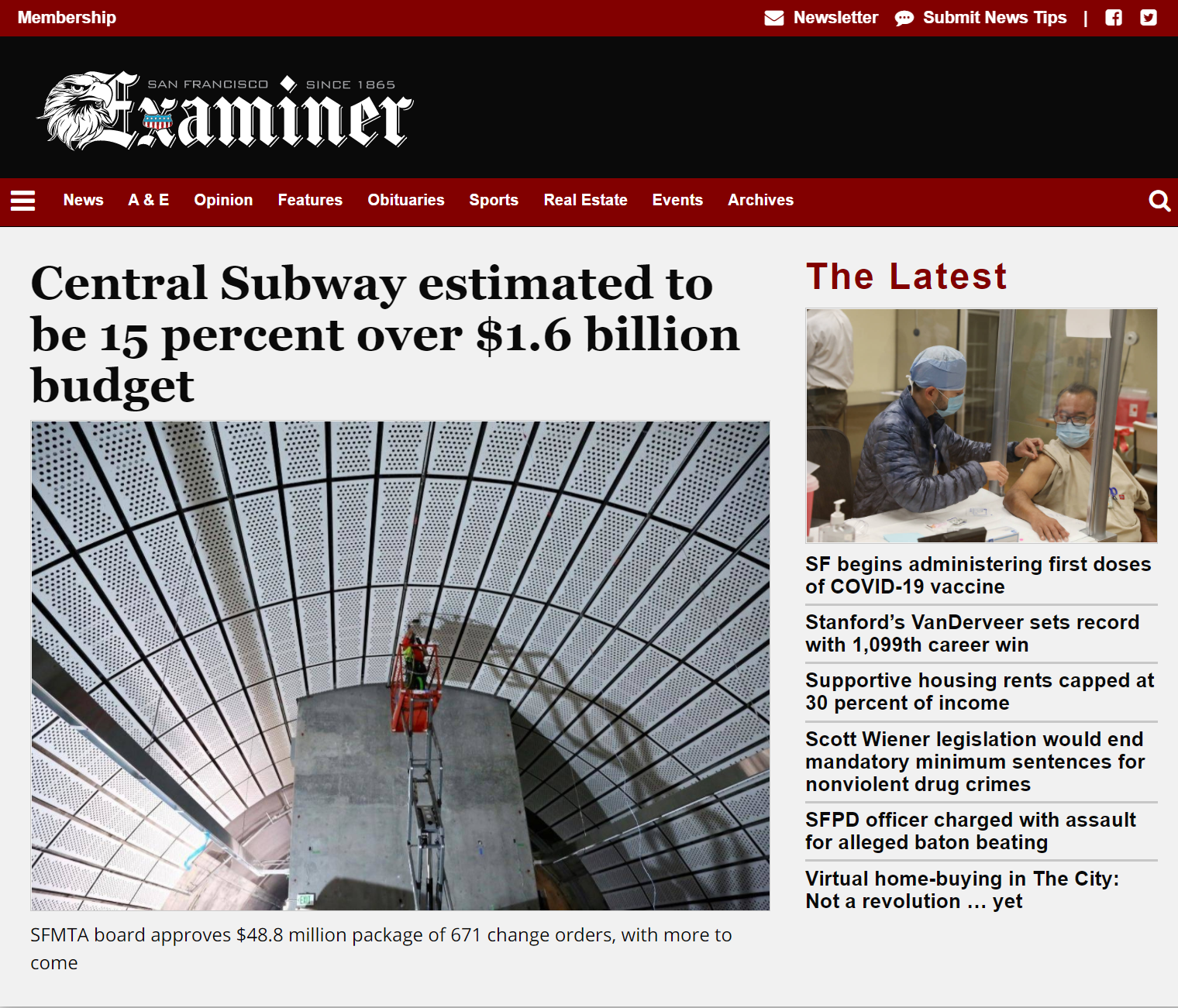
Let's take a couple of classic examples. Newspaper headlines, such as The Examiner San Francisco above, often use serif typefaces for headings. The headline is very eye-catching. This applies not only to the content, but also to the font used.
Then take a look at the Apple Store website. Sans serif typography is bold, effective and eye-catching. Both serif and sans serif styles can be equally effective.

Conclusion
So which is better: serif or sans serif fonts? It all depends on the use, the mood and the individual project. The best answer is usually the least clear - many great design projects include both styles. This applies to print and digital projects.
Serif and sans serif fonts can work in any application. The key, as with any design technique or tool, is the correct use of fonts, targeted and consistent with the content.