Typography trends are moving faster than many other design trends. For a long time, website designers have stuck with the classic sans-serif font selection. But now it is already obsolete!
Today's assortment and variety of web fonts opens up many more interesting possibilities for design, font pairing and visual themes.
We'll take a look at several font pairing trends with great examples covering a wide range of font families.
What is a font combination?
Font mix brings together different typefaces for use in a single design project. Although the term pair is used, font pairing can refer to the use of any number of fonts in the same project.
A good font pairing - usually no more than two or three typefaces - is harmonious while still providing sufficient contrast between letter styles. Pairs of typefaces often convey similar sentiments and have complementary forms so that they draw attention to the text, but do not compete with each other for attention.
Outline and Filled fonts pair
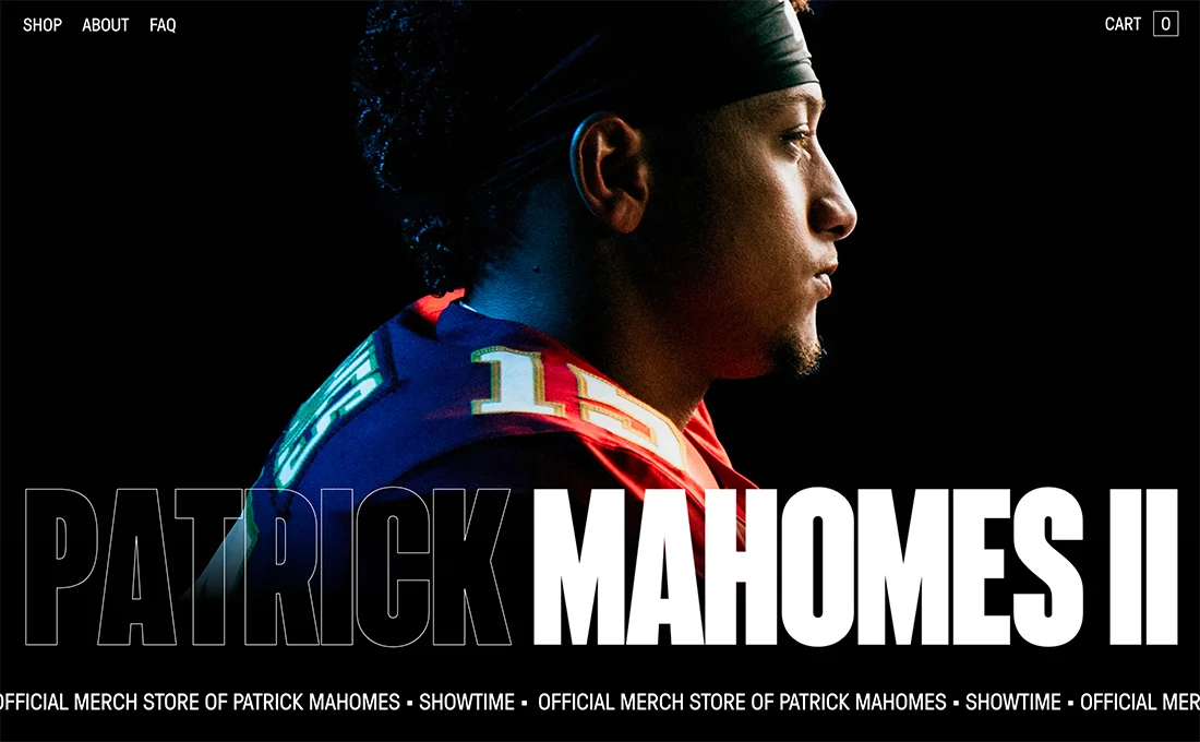
One of the biggest typography trends in 2021 could be the use of outline fonts. They have become extremely popular lately!
A transparent fill effect with an outline on the background, such as the example above, can be amazing and effective. An outline font may be the first thing you see, but filled words do matter. This style can work with almost all types of fonts, but is most commonly seen with sans serif fonts due to its readability and ease of creating clear outlines.
The trick with an outline font is to pair it with something else to ensure readability. Often, an outline typeface is combined with the same typeface, filled in for almost a yin and yang effect.
When working with this typeface combination, put the most important words in the filled font and reserve the outline for accent text.
Note that an outline font, no matter how widely used, will never have as much visual weight in design as a padded pad. Because of this, many designers use nearly twice (or more) text in outline fonts than filled ones, so words in the latter style have maximum emphasis.
Another nice thing about the outline and fill pair is that you often only need one font with both styles. This can make pairing fonts much easier.
Huge serif and regular sans serif fonts

Large fonts can be beautiful, especially when combined with each other. The trend is the use of large serif and sans serif fonts. What really makes this option work is layering a third line of smaller text using one of the larger font pairs.
This creates a nice typography layer effect and allows you to use a minimal amount of fonts in the process.
When using a pair of serifs and sans-serifs, remember that the difference between typefaces is a design trick in and of itself. Minimize other text effects or tricks when using this technique.
Also consider modern serifs with thick and thin strokes. This gives the design an extra level of elegance and grace.
Experimental font + normal sans serif
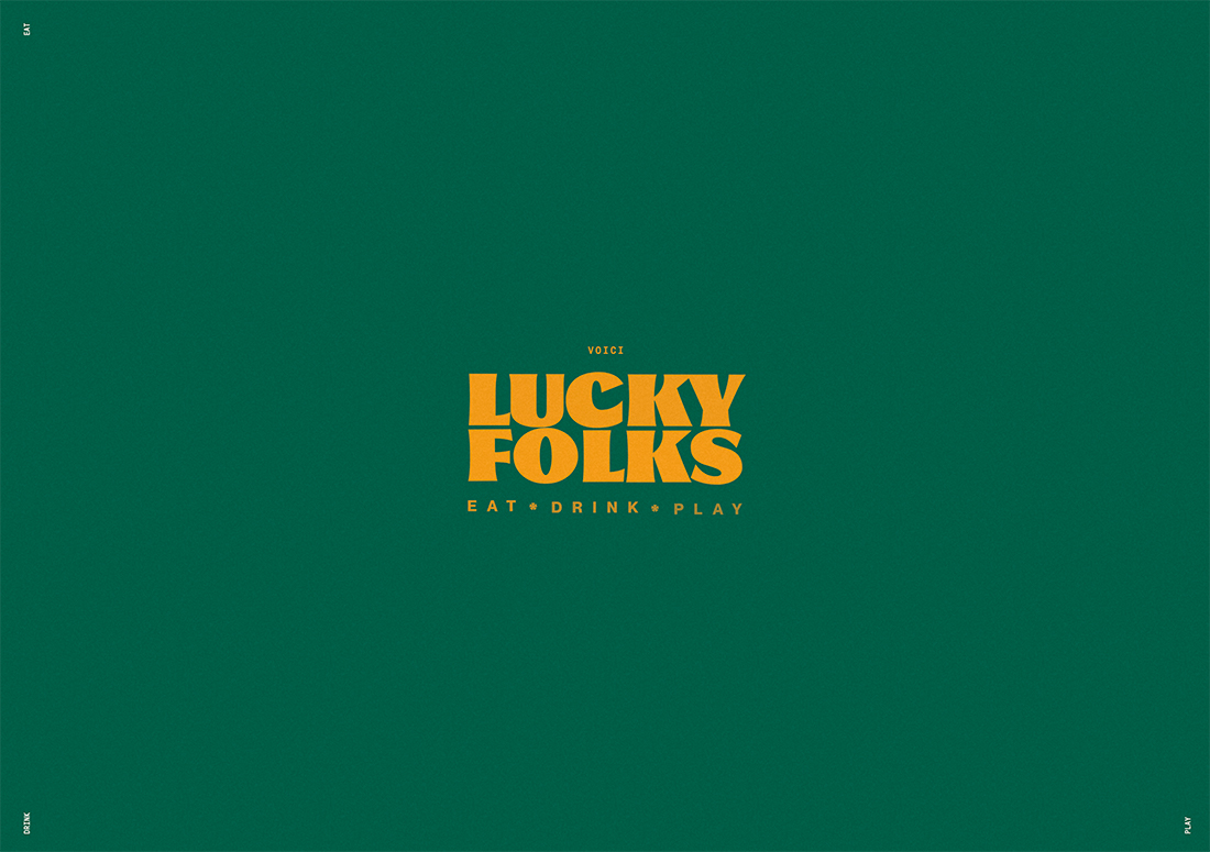
Experimental fonts are everywhere. And they are worth trying to use.
Combine an experimental font of almost any style - with a neutral sans-serif typeface. When looking for a neutral sans serif font, look for the average stroke width and average height along the x axis.
Avoid super thin or condensed options because they can hide the personality of an experimental typeface. If the experimental version has a clear letter shape, such as oval or round, try matching the sans serif version with a similar shape. This will help the experimental style really improve the typographic look and overall design.
Large sans serif fonts and smaller text layer
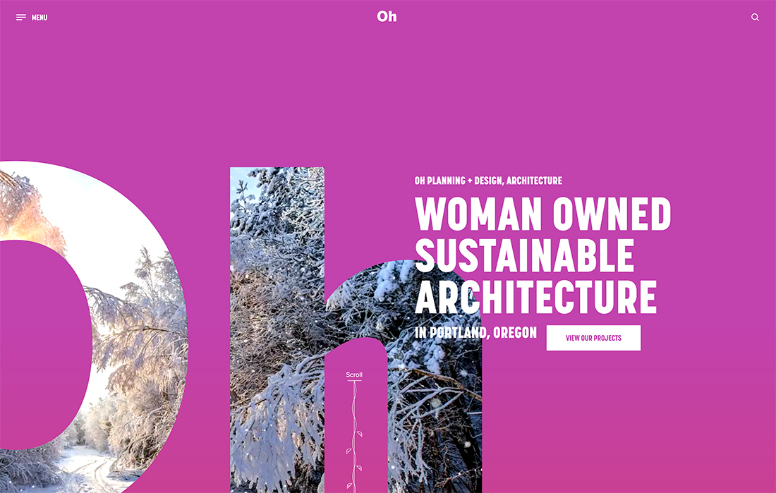
When it comes to typography, you would hardly think of combining oversized sans serif fonts with smaller sans serif fonts to create a layered typography style. This trend is starting to explode with the use of layered type as an artistic and informative element in website designs. While it sounds a little crazy at first, it can be downright awesome.
The way is to use simple sans serif fonts, keep letters and reading of oversized text to a minimum, and use simple aesthetics for the rest of the design.
Sans serif font family
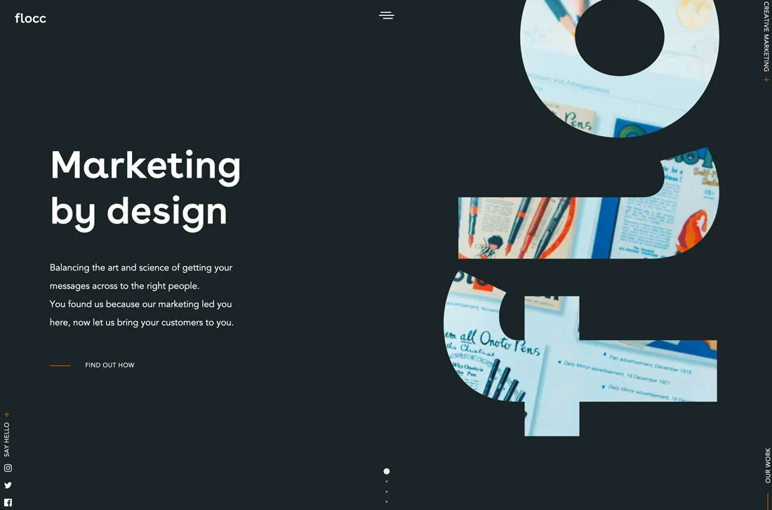
Pairs of fonts do not really have to be paired and from different families. You can safely use multiple styles from the same font.
This is a fairly popular method as it makes websites easier to read and always creates a design in which all text elements are harmoniously combined.
How to make it work, see the screenshot above. Combine the most contrasting styles from a font family for a nice design distinction. Combining bold with regular or light weight almost always looks nice and easy to read.
Slab fonts + simple sans serif fonts
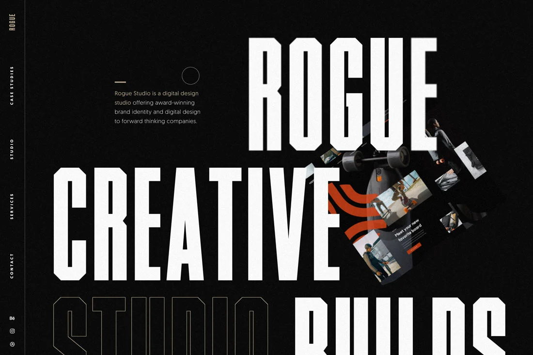
Slab fonts work well for creating a strong emphasis on text. But using a simple sans serif typeface can soften the style.
This is a classic typographic design trend that never gets old and is almost always effective.
Serif + Sans Serif + Script
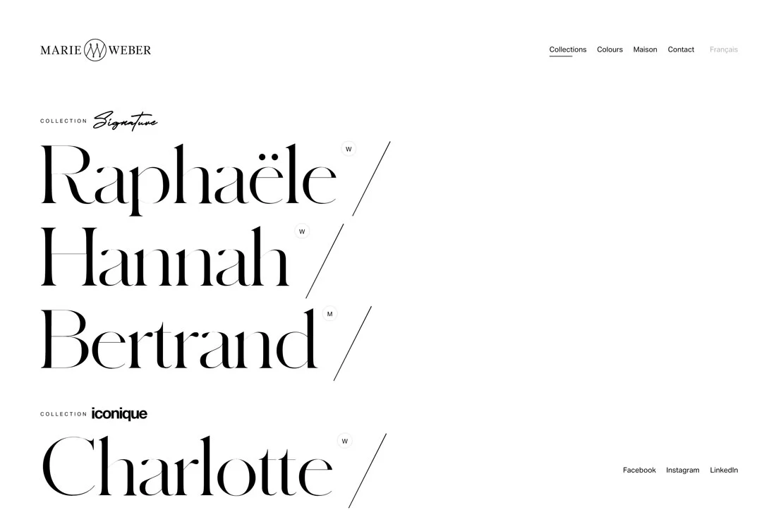
This trio of fonts sets the right tone. With a modern serif typeface, a simple sans serif typeface, and a handwritten typeface, it creates a classic and elegant impression.
The combination of three fonts is pretty common, and what helps it work well is the use of completely different styles. Using three sans-serif fonts can look awkward and visually weird because the styles don't differ enough.
Look for a trio of typefaces that look the same but have unique lines and designs.
Conclusion
The combination of fonts can be very interesting. Playing with different combinations can add new meanings to design projects. Just keep in mind some design golden rules when working with font pairs:
- Stick to two or three fonts but no more
- Look for complementary styles
- Always use one readable typeface.
